Best Letter KHN Logo Design Ideas | Free PNG & Vector Files
Ever stare at a blank screen, trying to mash three letters together into something cool for your brand? It's tough, right? Especially when you're dealing with initials. You know the drill: you sketch, you tweak, you try different fonts, you spend hours staring at potential color palettes, but nothing quite clicks. It either looks too plain, too complicated, or just... not *you*. You feel that pressure to make it unique, memorable, and actually look *good*, and sometimes those K, H, and N just don't want to play nice together, leaving you with something that feels generic and forgettable. But don't sweat it! If you're wrestling with how to make that perfect letter khn logo, you're in the right place. We're diving into some fresh ideas and approaches to turn those three initials into a killer visual identity that actually stands out and tells your story.
Table of Content
8 Letter KHN Logo Design
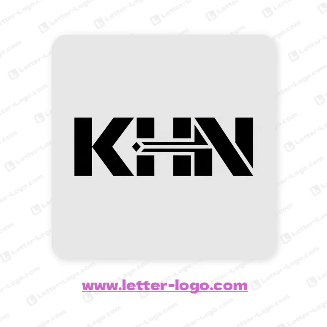
The letter KHN logo embodies a modern and minimalist design, cleverly integrating an arrow within the characters. This clever use of space creates visual interest. The sans-serif typeface employs bold, geometric shapes, giving the letter KHN logo a strong and recognizable appearance. A horizontal line bisects the "H," forming the arrow's shaft and pointing towards the "N."
DOWNLOAD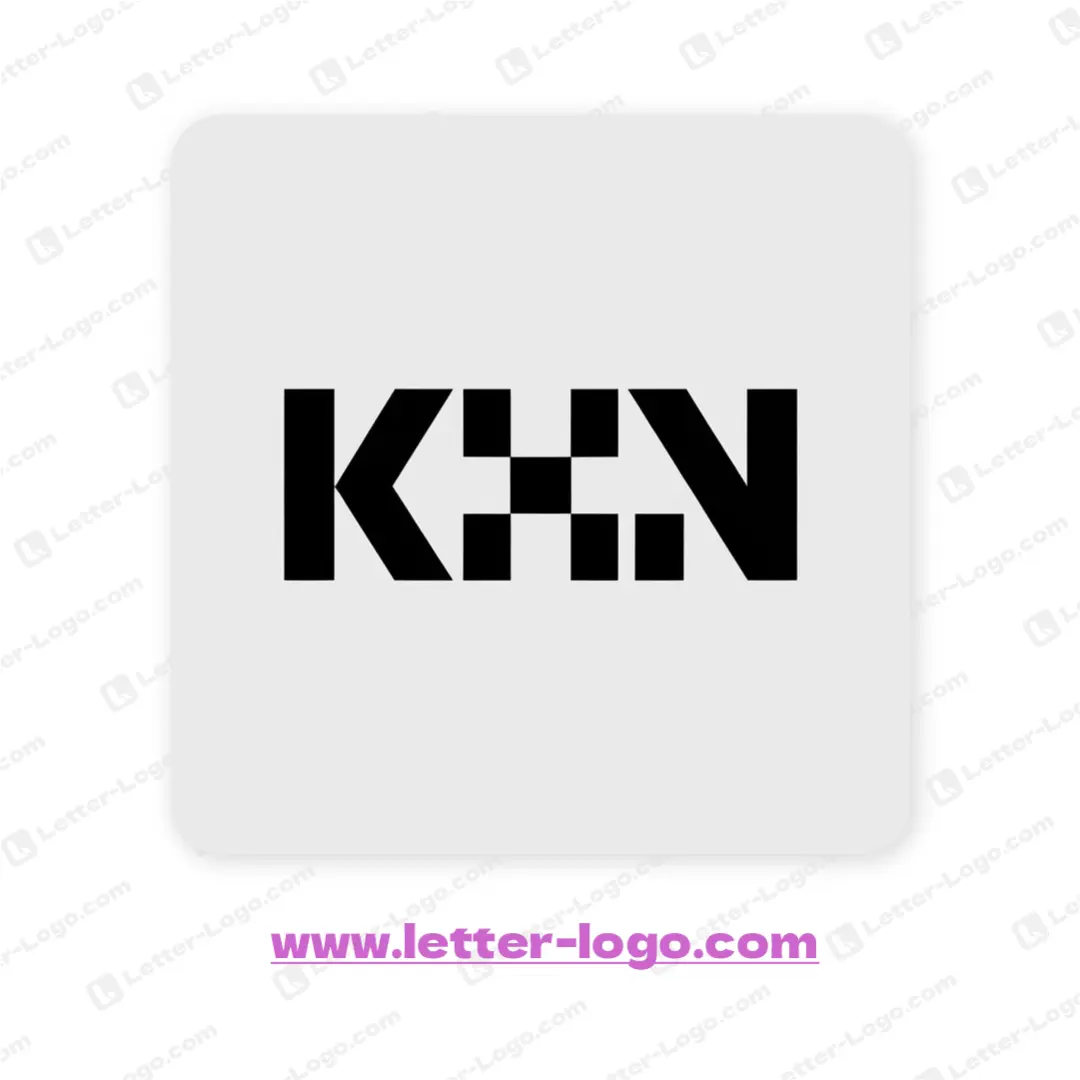
The letter KHN logo features a clean, geometric design with a modern aesthetic. The letters are constructed from solid blocks, creating a strong visual impact. A grid-like structure forms the central 'H', adding a distinctive element to the letter KHN logo. The consistent line thickness contributes to the overall sense of balance and clarity. The bold design of the letters gives a modern, sleek impression.
DOWNLOAD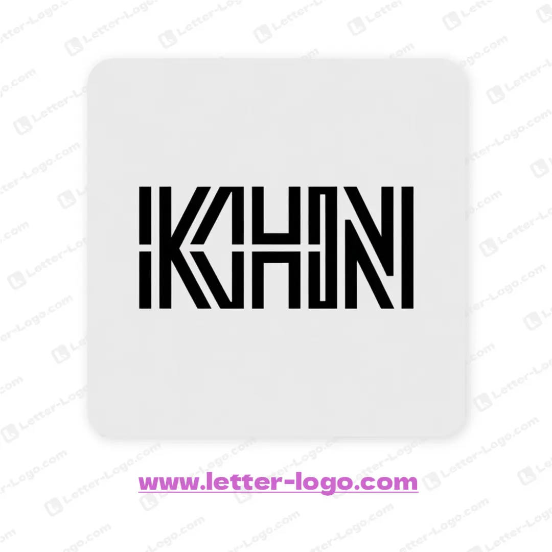
This sleek design of the letter KHN logo presents the characters in a bold, modern style. Each letter is formed from segmented lines, creating a unique, geometric aesthetic. The structural design features connected, yet distinct, shapes that define each letter, with a clever interplay of negative space to enhance visual clarity. The innovative approach makes the letter KHN logo both memorable and versatile.
DOWNLOAD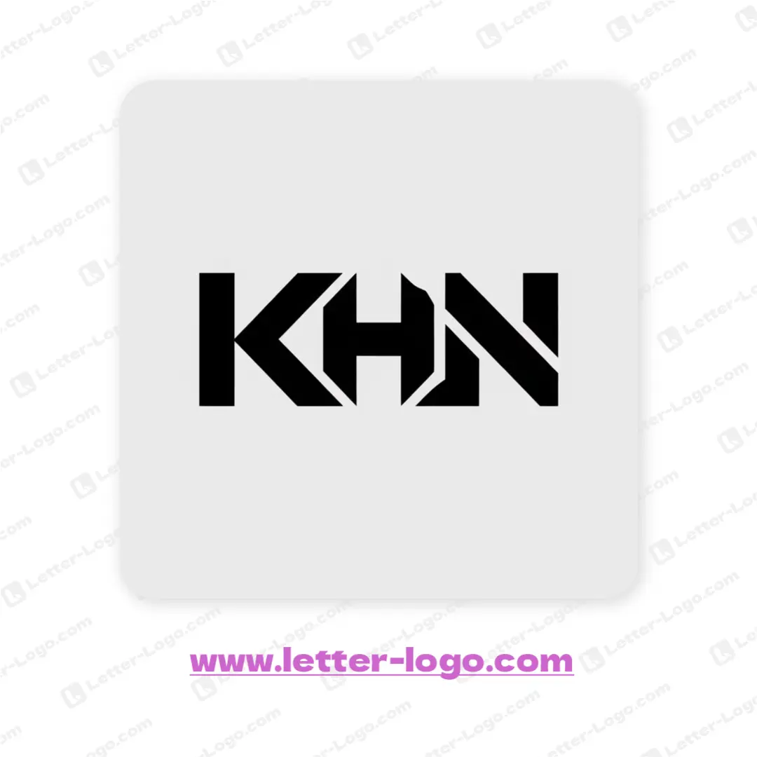
The letter KHN logo boasts a modern and geometric design, cleverly interlocking each character. The 'K', 'H', and 'N' share edges and lines, creating a unified, block-like structure. Angled cuts and sharp edges give the design a dynamic, almost futuristic feel. This letter KHN logo achieves a sleek and memorable brand identity through a smart combination of negative space and streamlined letterforms.
DOWNLOAD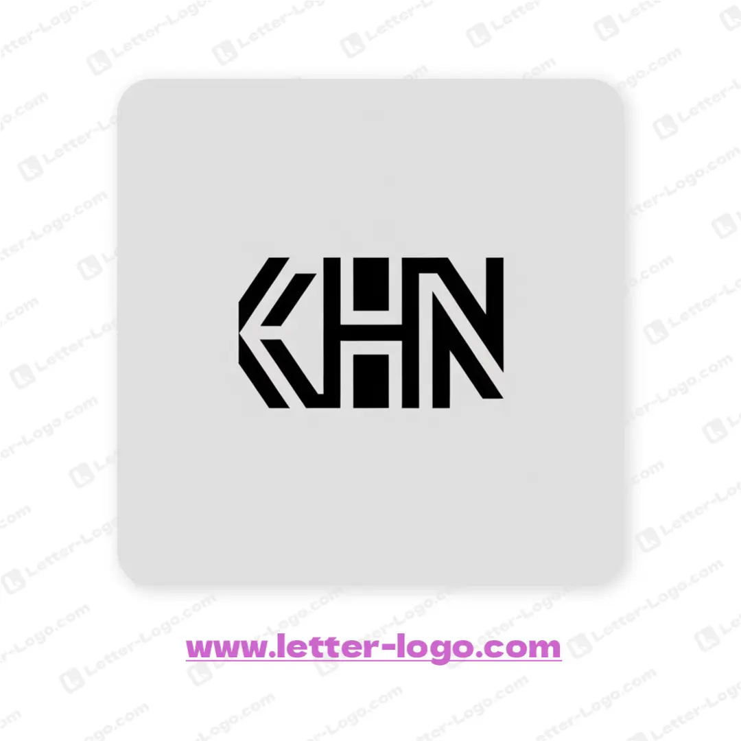
The striking letter KHN logo boasts a geometric design, artfully intertwining the three letters. Each character is constructed using bold, linear segments that create a unified and modern aesthetic. The 'K' features angled lines forming a chevron shape, leading into a minimalist 'H', and culminating in a diagonally segmented 'N'. This creates a unique, memorable logo design.
DOWNLOAD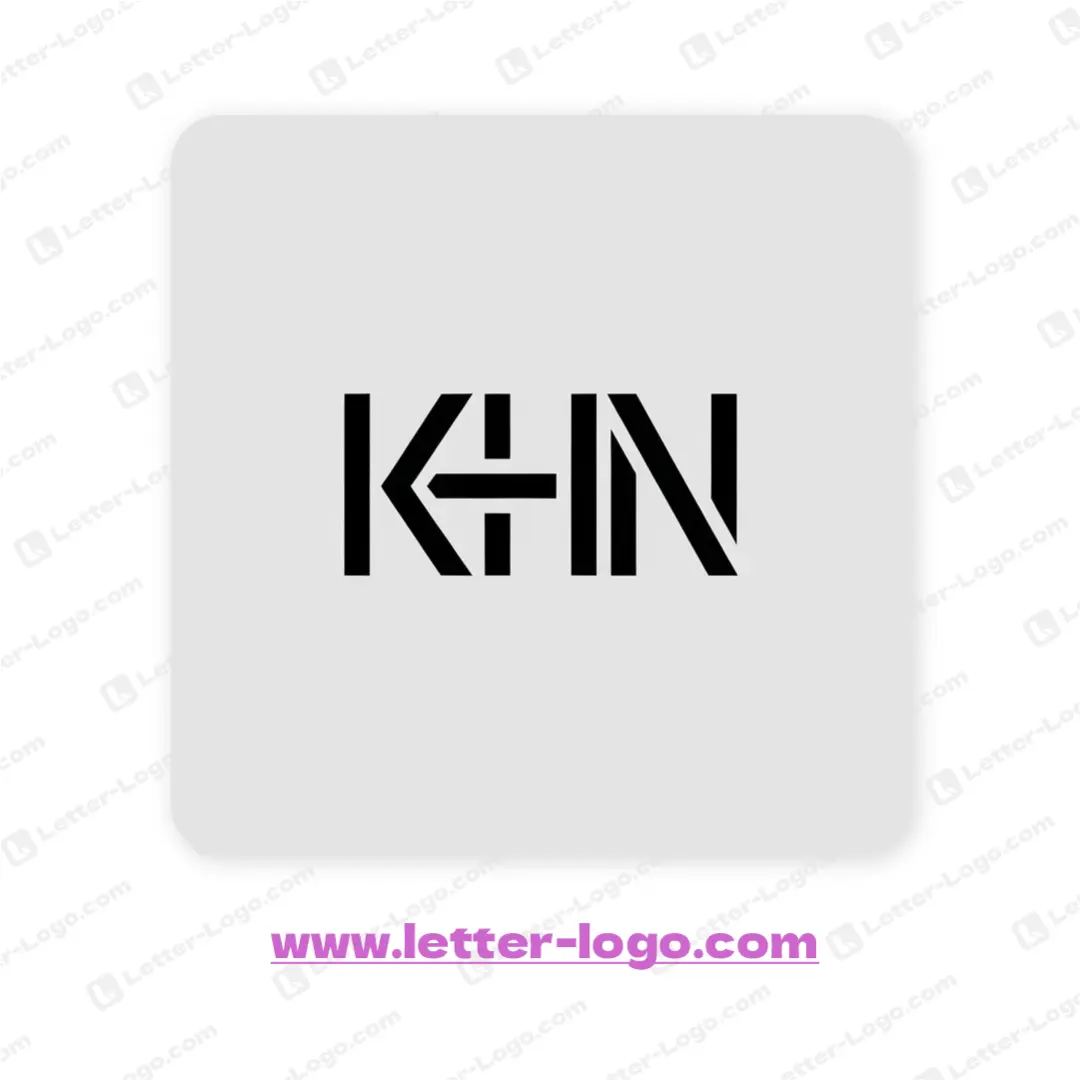
The design concept for the letter KHN logo merges geometric shapes and linear elements to create a modern and abstract mark. Bold, angular forms build the K, H, and N. The letters interlock and share sections, which form a unique visual. The simplicity and precision make this letter KHN logo a great representation of its brand.
DOWNLOADThe letter KHN logo design showcases a sleek, modern aesthetic. It uses a linear style, with each letter constructed from a series of parallel lines. The letters are closely connected and interlocking. This design concept creates a unified and memorable mark. The K and N are angled and the H is made of vertical lines. The letter KHN logo achieves a visually appealing and structurally sound result.
DOWNLOAD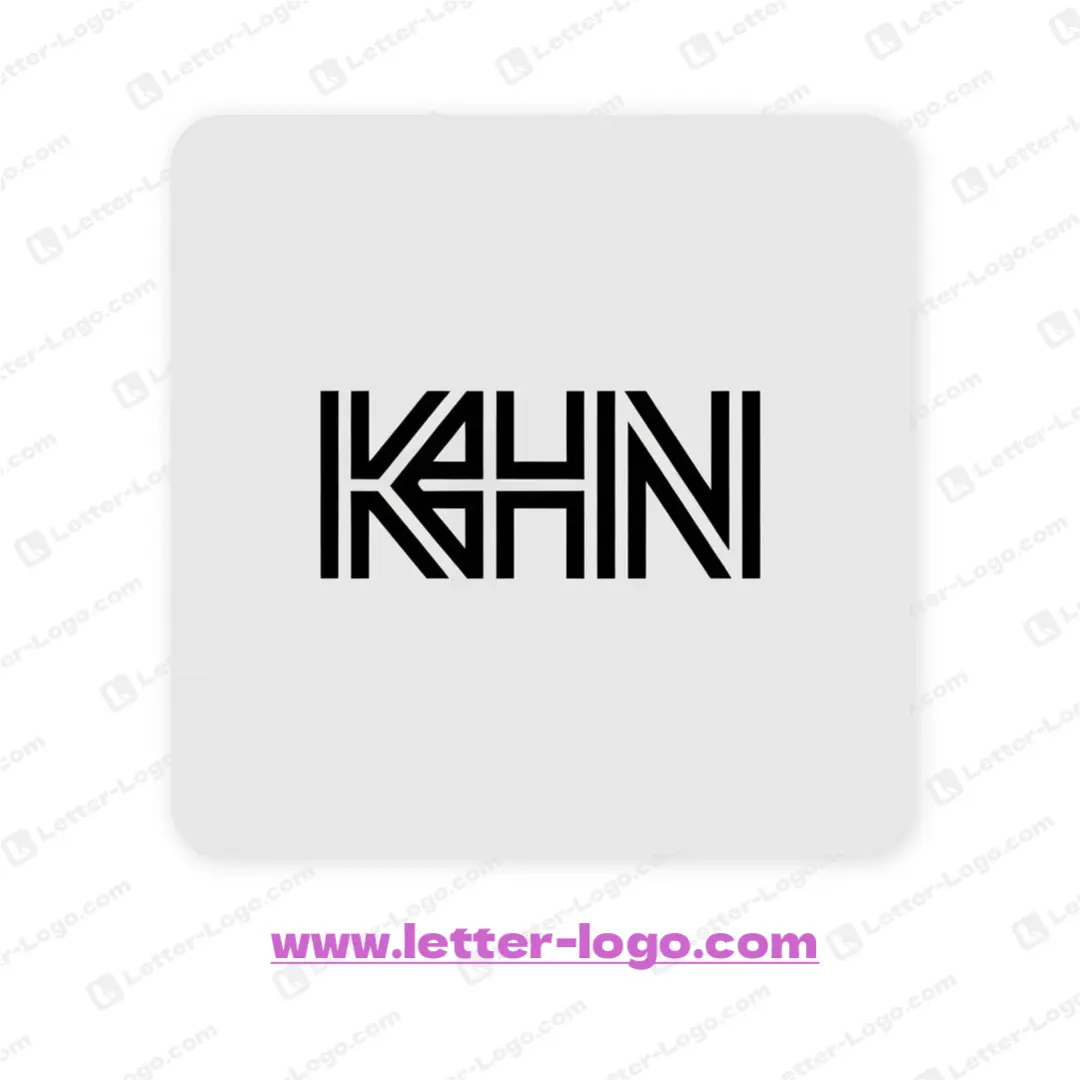
The letter KHN logo features a stylized design where the individual letters are interconnected, forming a unified symbol. Each character consists of bold, clean lines, creating a modern, geometric aesthetic. The 'K' and 'N' incorporate diagonal elements, adding dynamism, while the 'H' maintains a strong vertical presence. This unique structure visually blends the letter KHN logo into a cohesive monogram.
DOWNLOADLetter KHN Logo Maker
Color Palettes for KHN Logos
Choosing the right color palette is crucial for a KHN logo. Colors evoke emotions and communicate brand values. Consider palettes that are modern, professional, and relevant to your industry. Think about the message you want to convey – trust, innovation, or creativity.
Blue
Blue often represents trust, stability, and professionalism. It's a popular choice for corporate logos, especially in industries like finance and technology. A KHN logo in blue can convey reliability.
Green
Green symbolizes growth, health, and nature. It's a good option for KHN logos related to healthcare, sustainability, or environmental initiatives. It can also represent balance and harmony.
Gray
Gray conveys neutrality, sophistication, and balance. It works well as a base color or accent color in a KHN logo, providing a clean and modern look. It can also represent intellect and formality.
Typography and Fonts for KHN Logos
The font you choose for your KHN logo significantly impacts its overall look and feel. Select a font that is legible, memorable, and complements the visual elements of the logo. Consider whether you want a serif, sans-serif, or script font based on your brand identity.
Sans-Serif Fonts
Sans-serif fonts are known for their clean and modern appearance. They are often used in tech and contemporary brands. Examples include Helvetica, Arial, and Open Sans. Their simplicity makes them highly readable.
Serif Fonts
Serif fonts have small decorative strokes at the end of each letter, giving them a classic and traditional feel. Examples include Times New Roman, Georgia, and Garamond. They are often used to convey elegance and authority.
Font Pairing
Combining two different fonts can add visual interest to your KHN logo. A common strategy is to pair a serif font with a sans-serif font to create a balanced and harmonious design. Ensure the fonts complement each other in terms of weight and style.
Layout and Composition Ideas
The arrangement of the letters K, H, and N is crucial for creating a visually appealing and memorable logo. Experiment with different layouts to see what works best for your brand. Consider using negative space, overlapping elements, or abstract shapes to create a unique design.
Letter Overlap
Overlapping the letters K, H, and N can create a sense of unity and connection. This technique can also lead to interesting abstract shapes and visual effects. Experiment with different degrees of overlap and transparency.
Negative Space
Using negative space effectively can make your KHN logo stand out. Create shapes and patterns within the empty spaces around the letters to add depth and visual interest. This technique can also convey a sense of sophistication and cleverness.
Letter Combination
Consider combining two of the letters into a single glyph, such as merging K and H, and then integrating the N separately. This can create a unique and memorable visual. This often works well when the letters share similar shapes.
Industry-Specific KHN Logo Designs
Tailor your KHN logo to reflect the specific industry it represents. A logo for a healthcare company will differ significantly from a logo for a tech startup. Consider the target audience and the message you want to convey.
Healthcare
For healthcare-related KHN logos, consider using colors like blue, green, and white to convey trust, health, and cleanliness. Incorporate symbols like hearts, crosses, or caduceus to further reinforce the industry connection. A clean and professional font is also essential.
Technology
For technology companies, opt for modern and minimalist designs. Use sans-serif fonts and bold colors like blue, black, and gray to convey innovation and sophistication. Consider incorporating geometric shapes or abstract patterns to represent technology.