Creative Letter BBU Logo Design Ideas (FREE PNG & Vector)
You know that feeling when you're staring at a blank screen, trying to conjure up a logo that feels fresh and represents your brand perfectly? It's tough, right? Especially when your brand initials are something like BBU. How do you make those three letters pop and stand out in a crowded market where everyone's vying for attention? It's easy to fall into the trap of generic block fonts or predictable shapes, leaving you with a design that just feels... forgettable. You don't want your logo to be just another visual noise; you want it to grab people and tell your story instantly. The pressure to create something unique and impactful, even from simple letters, can feel overwhelming, making every design attempt seem kind of 'meh'. Well, take a deep breath. We've all been there, wrestling with initials. But tackling a specific challenge like a letter bbu logo can actually be the perfect catalyst for some seriously creative thinking. Instead of seeing limitations, let's explore how to turn those letters into a design that's truly memorable and reflects your brand's personality.
Table of Content
8 Letter BBU Logo Design
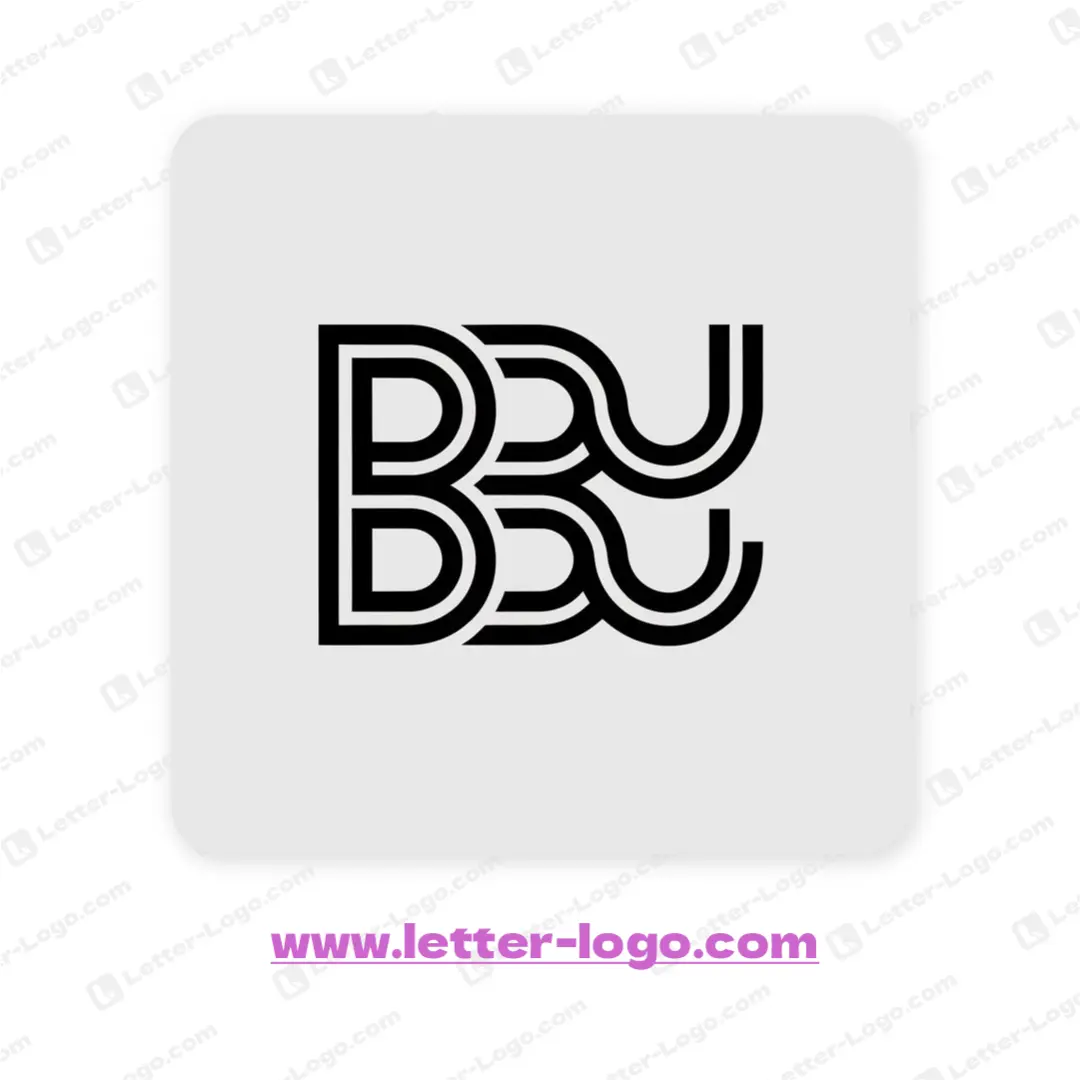
This visually striking letter BBU logo presents a modern design featuring thick, parallel lines creating a cohesive and structured form. The two letter Bs are stacked vertically on the left side. The last U letter is represented as two semi circles on the right. This gives the design an aesthetic look that is well balanced.
DOWNLOAD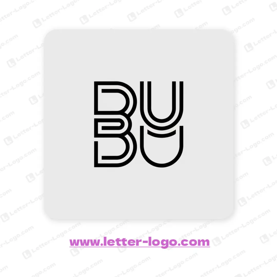
This innovative letter BBU logo showcases a modern and minimalistic design, focusing on clean lines and geometric shapes. The repeated letters are stacked and aligned, creating a symmetrical and balanced visual. Each letterform is crafted with a double-line effect, providing depth and a subtle three-dimensional appearance that strengthens the overall composition of the logo.
DOWNLOAD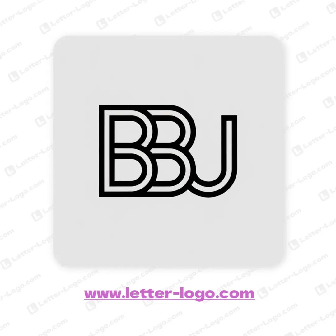
The letter BBU logo features a modern, interconnected design. Each letter is crafted with a bold, consistent line weight, creating a unified visual impact. The repeated 'B' shapes nestle together, leading into the flowing curve of the 'J', to make a coherent design for the logo, where the lines overlap to create depth and visual interest in the letter BBU logo.
DOWNLOAD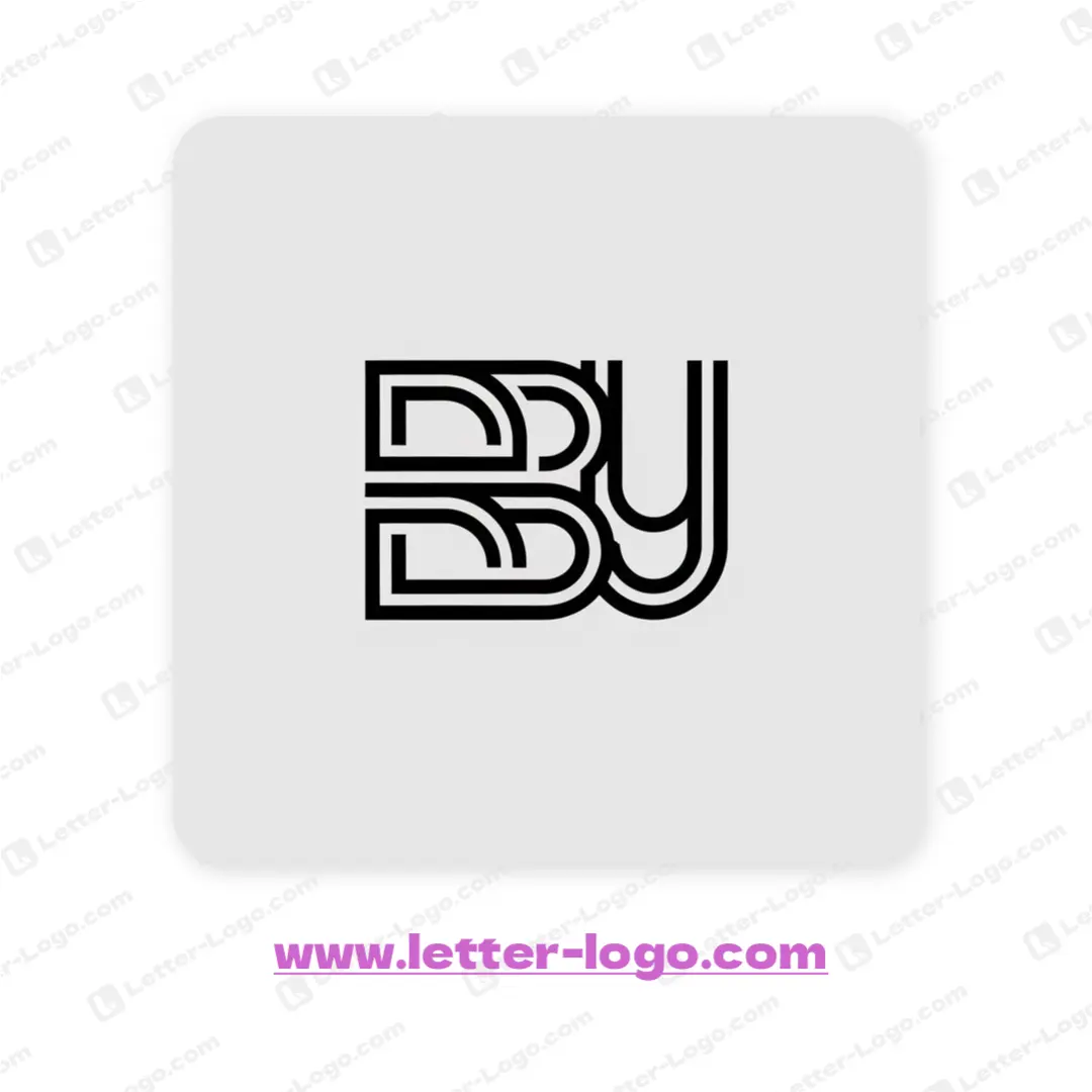
The sleek letter BBU logo features a modern, interconnected design. Each letter is formed by parallel lines, giving a streamlined appearance. The two "B" characters stack vertically on the left, while the "U" stands tall on the right, visually balancing the entire composition. The lines seamlessly merge, creating a unique and cohesive monogram.
DOWNLOAD
The letter BBU logo is a bold, geometric design, featuring the three characters prominently displayed side-by-side. A distinctly modern and powerful aesthetic is achieved through sharp angles and clean lines, forming a robust visual impact. Each character is designed with similar stroke weights, providing visual balance, and creating a unified, cohesive letter BBU logo.
DOWNLOAD
The design concept behind the letter BBU logo features a modern and minimalist approach, emphasizing clean lines and geometric shapes. The letters are constructed using a double-lined outline, creating a layered effect. Each character is distinct yet interconnected, forming a cohesive visual unit. The U has a distinct shape with its rounded lines. Overall, it has a bold and memorable mark.
DOWNLOADThe letter BBU logo features three distinct characters arranged in a concise, memorable design. Two stylized 'B' shapes flank the central 'U,' creating a cohesive visual unit. The 'B' glyphs display sharp, angular lines, while the 'U' incorporates softer, rounded features. A uniform stroke weight throughout the letter BBU logo ensures visual balance and modernity in its compact structure.
DOWNLOAD
The sleek and modern letter BBU logo features a clean, outlined design where each letter is constructed with uniform line thickness. This stylistic choice provides a sense of balance and unity. The first two "B" letters have a rounded shape, while the "U" has a diamond shape above it, giving the letter BBU logo a memorable and recognizable aesthetic.
DOWNLOADLetter BBU Logo Maker
Understanding the Letter BBU in Logo Design
The letters 'BBU' present a unique challenge and opportunity in logo design. Their visual weight and potential for symmetry allow for creative exploration. Understanding the core principles of logo design, such as simplicity, memorability, and versatility, is crucial when working with these letters.
Simplicity
A simple logo is easier to recognize and remember. For 'BBU' logos, consider minimalist designs that focus on clean lines and negative space.
Memorability
An effective logo should be easily recalled. Unique letter combinations or creative use of typography can make your 'BBU' logo stand out.
Versatility
The logo should work across various platforms and sizes. Ensure your 'BBU' design is scalable and legible in different contexts.
Typography
Choosing the right font is crucial. Experiment with different fonts to see which best represents the brand identity associated with the 'BBU' logo.
Creative BBU Logo Design Ideas
Let's explore some creative ideas for designing a 'BBU' logo. These ideas focus on different approaches, from abstract representations to letter combinations and symbolic elements.
Abstract BBU Design
Create an abstract symbol that incorporates the essence of 'BBU' without directly representing the letters. This can be achieved through geometric shapes or fluid lines.
Letter Combination
Combine the letters 'B,' 'B,' and 'U' in a visually appealing way. Experiment with overlapping, interlocking, or mirroring the letters to create a unique mark.
Negative Space
Utilize negative space to form the letters 'BBU'. This can create a clever and memorable logo.
Symbolic Representation
Incorporate a symbol related to the brand or company that the 'BBU' logo represents. This could be a visual metaphor or a relevant icon.
Color Palette Considerations for BBU Logos
The color palette plays a vital role in conveying the brand's message. Choose colors that align with the brand's personality and target audience. Consider the psychological effects of different colors when making your selection.
Blue
Blue often represents trust, stability, and professionalism. It's a popular choice for corporate 'BBU' logos.
Green
Green symbolizes growth, nature, and harmony. It's suitable for 'BBU' logos related to environmental or health-focused businesses.
Red
Red conveys energy, passion, and excitement. Use it sparingly and strategically in 'BBU' logos to grab attention.
Monochromatic
Using a single color with varying shades can create a sophisticated and minimalist 'BBU' logo.
Examples of Effective BBU Logos (Hypothetical)
While real-world examples of prominent 'BBU' logos might be limited, we can imagine some hypothetical scenarios to illustrate effective design principles. These examples showcase different approaches to typography, color, and symbolism.
BBU Tech: Interlocking Letters
Imagine a tech company called 'BBU Tech' with a logo featuring interlocking 'B's and a 'U', using a modern sans-serif font and a vibrant blue color scheme. This conveys innovation and connectivity.
BBU Naturals: Leaf Motif
For a natural products brand named 'BBU Naturals', the logo could incorporate a stylized leaf shape integrated with the letter 'U', using earthy tones like green and brown. This represents natural and organic products.
BBU Studios: Bold Typography
A creative studio called 'BBU Studios' might have a logo with bold, geometric typography, emphasizing the 'B's and creating a strong visual impact. A black and white color scheme could convey sophistication and creativity.